Image to text
Wednesday, July 15th, 2026
At The Web You Want event in Amsterdam last month, Léonie gave an absolutely fantastic talk. You can now read the whole thing: Accessibility is resistance!
She makes the very good point that generative tools are a necessary accessibility recourse when humans have failed to do their job properly.
Images without alt text? Somebody messed up. But this is damage that can be routed around with large language models.
So if you—like me—don’t like the idea of people using extractive generative tools made by the worst kind of people, pay heed:
If you want to resist AI, make accessibility part of everything you do, every decision you make, every product you design and build. Remove the need for people to use AI to compensate, and remember, accessibility is resistance.
Also last month, I wrote about enhancing images from a carousel to masonry using CSS Grid Lanes. Here’s the context:
Over on The Session, I added a little enhancement to the events and sessions listings recently. I make a call to the Google Places API to see if I can find a match for the venue, and if I do, pull in some photos.
Sidenote: right now there’s a major issue with this. None of the photos come with text descriptions. This is something I need to fix, and I’ve got some ideas on how to do that.
I was one of those people with a website that doesn’t have alt text for images. I was one of those people not doing their job.
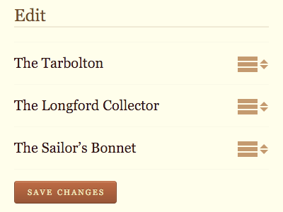
The first fix I put in place was very much in keeping with the ethos of The Session. I added a form so that any member of the site can edit the alt text of the images in the carousel/masonry layout.
The Session is quite WikiPedia-like. Anyone can edit the track listings in the discography. Anyone can edit the details of any tune. Anyone can edit the details of any session or event. So it made sense to add one more thing that anyone can edit.
With that functionality in place, I put out the call:
If everyone were to take just one or two sessions or events and add alt text to the photos, it would really, really help make the site more accessible.
The community went to work and did a pretty good job.
But there are a lot images. I’d like to have a least some kind of alt text for all of them, even if it’s just a placeholder until someone gets around to adding something better.
I was going to have to use generative “AI”, wasn’t I?
Holding my nose, I investigated some alt-text-as-a-service APIs out there. I signed up for some trials and kicked the tyres. They were rubbish. I suspect most of them were vibe-coded.
The more I thought about it, the more I realised that I probably didn’t need the latest and greatest energy-guzzling large langauge models. Some good old-fashioned machine learning could do the trick here. I’m aiming to do a relatively straightforward transformation—image to text.
Check out the COCO project: Common Objects in Context. It’s a few years old now, but it’s basically a dataset that’s been trained on images.
Ah, but where did the training data come from?
All images in COCO were sourced from Flickr, a photo-sharing platform where users upload images under various Creative Commons licenses.
Works for me!
I found a model on Hugging Face that was created by Microsoft from the COCO data. Confusingly the model is called GIT. It’s nothing to do with version control. It stands for GenerativeImage2Text.
I downloaded the model and set to work creating a script to trawl through all those images and generate alt text if the image doesn’t already have one.
I should mention: the way that I store the alt text is not in a database, but in the file system. Every image has its own folder. Inside that folder there can also be a file called alt.txt.
So the script needed to loop through lots and lots of folders, generate alt text where needed, and save it into a text file in the same folder.
Python is the go-to language for working with models like GIT. But Python is not my strong suit, to put it mildly. And this was going to be a throwaway script that I was only going to use once. So I held my nose again and turned on Copilot in VSCode (I usually keep it switched off).
With the right instructions I was able to get a script that—crucially—I could read and understand. Then I switched off Copilot and had a shower to try to wash the shame away.
Long story short, the script worked.
The results are mostly fine. The alt text is functional. Sometimes it’s wrong, but not disastrously so. A human-generated image description will always be preferable, so any member of The Session can over-ride the placeholder alt text.
It took a few hours to loop through all those folders and generate all those text files. My laptop got hot. But doing it locally sure beats paying for tokens from the baddies.
While the utility is there, the current landscape of these frontier corporate models comes with massive ethical and environmental baggage. This is not a long term solution!
That’s exactly why my hope is that ethically trained open-weight models will eventually catch up and that in the next couple of years, we’ll have something with this level of capability that can run locally. That feels like a much better place to be with this technology.


